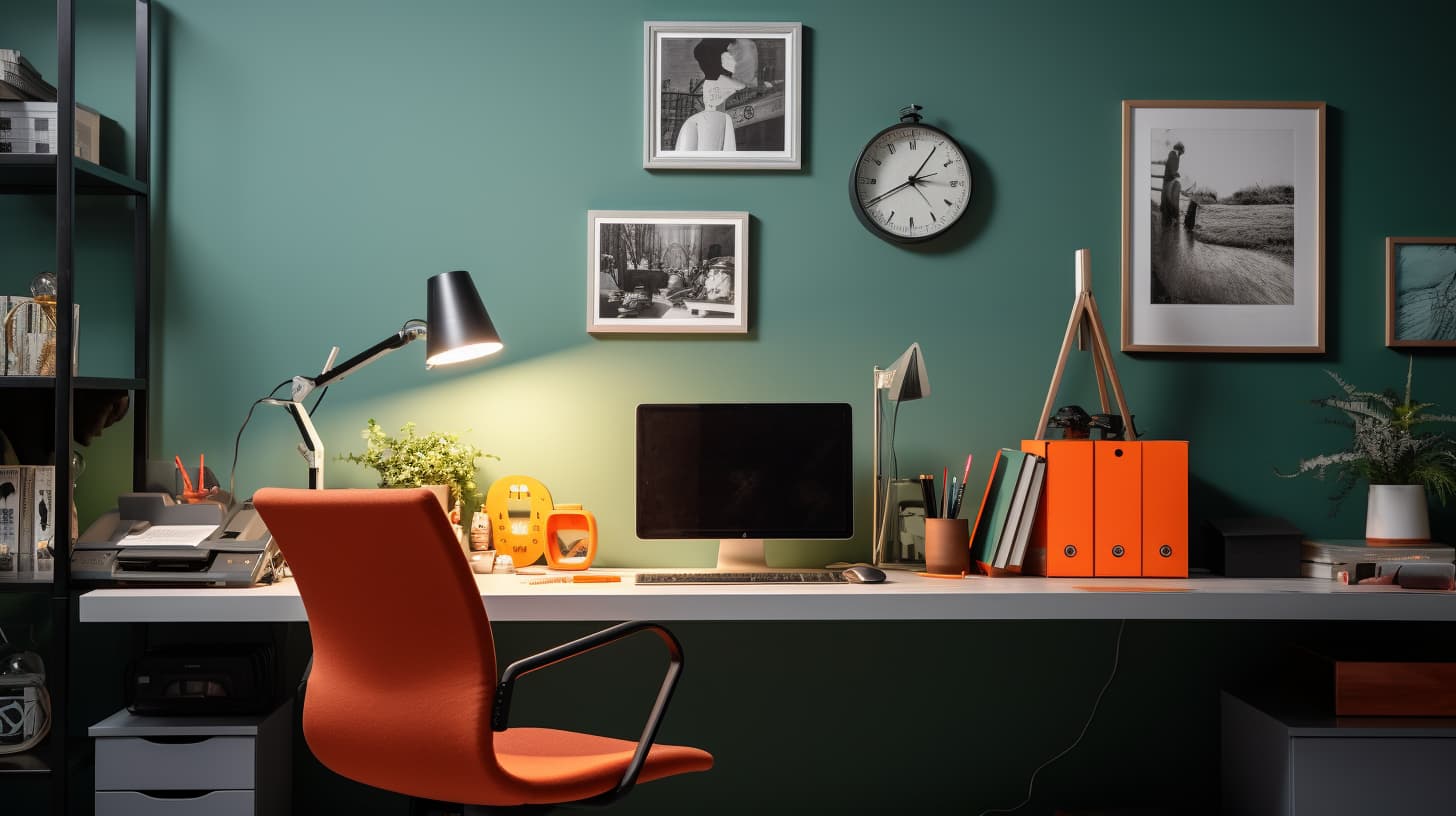
Picture the following situation:
You are in a nice restaurant. The food is really good and the service is amazing. Your experience is really pleasant, but something is still bothering you, something you can’t exactly put your finger on. Then you realize that the color of the walls might not be right, the position of the tables or the spacing between the tables is off.
What does it mean?

Even if the basic services were good, had this same restaurant invested in the visual details, the place would probably be more comfortable. It could be the difference that would make you return on other occasions.
So, how the heck is this related to Digital Design?
In the evolution of design, we learned that Design Thinking must be done according to user needs, and how important functionality is. Together with that thought, came the need to invest a lot more time and money in the functional part of the experience. This is understandable and the right thing to do, but we can’t forget that visual elements are also part of the experience.
To answer this question, we have to stop and reflect about everything that makes a project complete – from the very beginning, until its launch to the users.
Visual Background
When digital design began to be valued and appreciated, the focus was initially on how it looked and how attractive it was. With the development of Design Thinking, in general, we realized that pure aesthetics on a platform weren’t enough to fill the needs of clients and users.
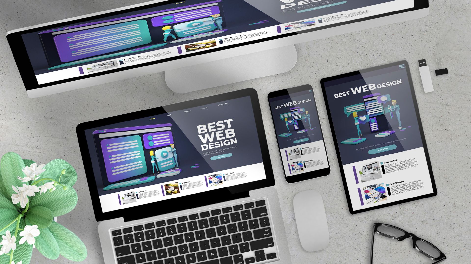
In the Mobile Age which we live in, we must be faster, clearer and straight to the point with our intentions when presenting a digital product to users; efficiency really can make the difference between the user staying or leaving the environment. Functionality and efficiency have been the great focus, and certainly it is a great achievement, but what happens when we neglect the aesthetic factor?
Users’ Perception
Do you remember the little story about the restaurant I told you at the very beginning of this article? Everybody likes to stay in a beautiful place, right? Because it is more comfortable, it is relaxing. Consciously and subconsciously, people care about aesthetics, about colors, sizes, patterns, and even ‘fluffiness’. It is a human thing. We like beautiful stuff.
The relation to this aesthetic care in the digital environment could be translated into some examples, such as when there are good patterns on spacing and alignment rules, typography choice, color scheme, image treatment, iconography and illustrations style and so on. Long story short, there must be a good and consistent design system. When these points are not well executed, it can cause one of the worst kind of bad experiences for the users: when they feel that something is wrong, but they don’t exactly know what it is. That is indeed frustrating.
A good example of a product (well, rather a service) which has both the function and the visual well combined is AirBnb.
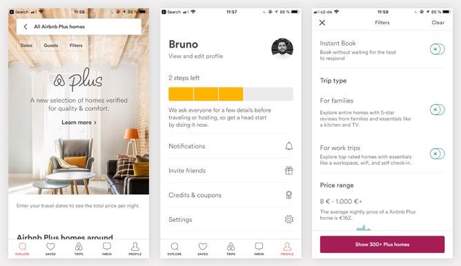
When we analyze and experience AirBnb we realize why it is a reference today. The brand has its own design system, a consistent and good visual representation on different platforms plus great functionality in an attractive service. That combination makes the user explore longer.
In the story of AirBnb’s success, aesthetics played a big role. Back in 2009, while trying to understand why they weren’t growing, they noticed a pattern on their listing: bad homemade photos ineffectively described what people would pay for. Then, the three founders went to New York, and upgraded the old pictures with beautiful high-resolution ones with a rented camera. This was a turning point for the company. It doubled their weekly revenue.
The Other Way Around
Of course, the aesthetic factor will not solve all the problems by itself. As I mentioned before in the restaurant’s story, it wouldn’t work properly if the environment was beautiful and comfy, but the food and services were awful. The visual design needs to have a purpose. It can’t just be decorative or something that the designer likes personally. The main role of a good visual designer is to be ‘the bridge’ connecting the business needs, user needs and the aesthetic factor to build something attractive and functional.
In the end, we need to consider the explicit (functional) and the implicit (visual) factors in order to create a well-rounded experience.

What really matters for the sake of the final product, it neither needs to be useless to be beautiful nor ugly to be functional.
Aesthetics and functionality should walk side by side. Some companies, studios, and designers care only about the functionality and launch their products with the ‘minimum acceptable visual’, with an interface not ugly, but also not nice. Refined visual, could transform the product from something regular to something outstanding.